
We are almost getting to the fun part of the project: the final layer of painting & putting on color.
Painting the primer was an epic ordeal. Because we were getting rid of smoke smells, we had to coat everything (including closets, doors, all trim) with a serious oil based primer. This primer isn’t one of those nice, low-VOC paints. It’s smelly, gluey to apply, and dries very quickly, which means you have to do as much of it as you can in one go.
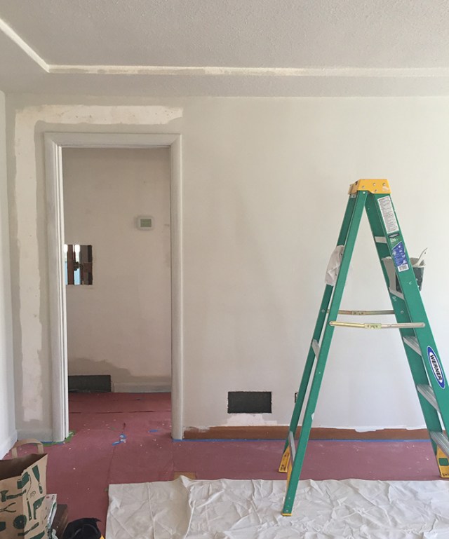

It has gone really well. The smell of the paint was as bad as expected, but we wore Niosh masks and powered through it. The other good thing is that its drying time is about an hour, so it didn’t linger too long with open windows on the rooms that we finished. We did 2 coats in many areas. After the TSP wall wipe down, it feels like days upon days have been spent on removing smoke tar from walls. We were musing that we should get a tax break for the smoke mitigation, since it feels like we are a hazmat clean up crew that is going through a painstaking & expensive process to make this space clean & healthy again.
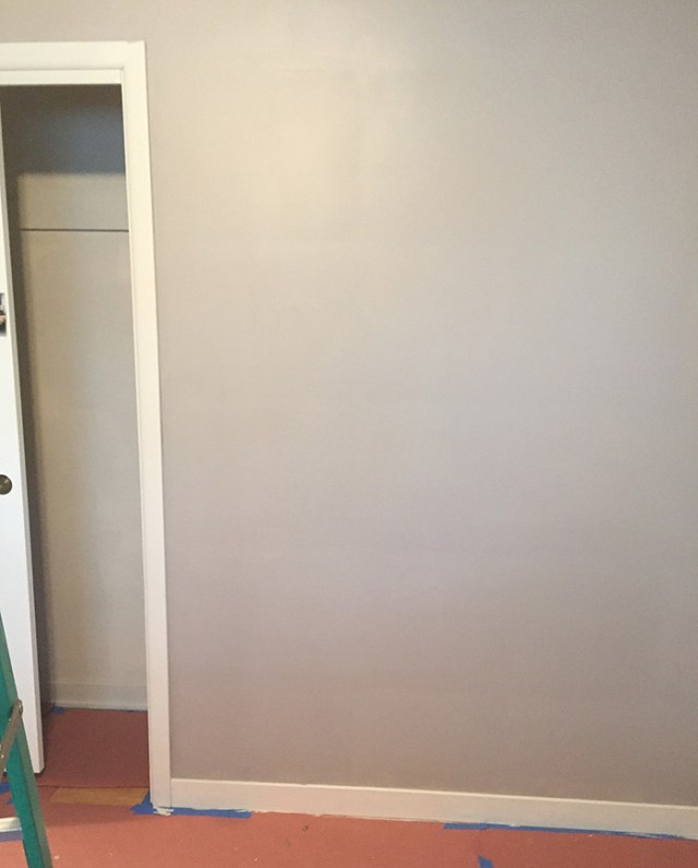
In the interest of expediency, we selected our favorite color from the Manor to cover all rooms of the house. It’s a fantastic neutral color that is really versatile. We decided to pick one variation to the monochrome of the house in the bedroom. We wanted dark and elegant. We got a bunch of color samples to test on the walls. Something we learned at the Manor was that a color looks one way on a card at the paint store, but then you paint a big test square on the wall and get unexpected results. A color you thought was perfect looks terrible. Or a color you were lukewarm about looks amazing, and that is the one you fall in love with. This was the case with our bedroom testing colors.

We were excited to go super dark in the bedroom, but all the dark grays had too much color tone in them (blue, green, brown). Plus, we got a little spooked by the intensity of the colors in a small room. I like dark walls, but every dark wall color inspiration I found was too dark. On a whim at the paint store we selected a lighter gray to test (“functional gray”) and BOOM! That was a keeper.
Here’s how it looks after the first coat:
We are going to do something a little flashy on the wall behind the fireplace. It’s the first wall you see when you walk in the door and anchors the mantle & fireplace. We’re geoing to paint it a snazzy gold/bronze and build some horizontal reclaimed wood panels. Now this is where it gets fun!


What’s the color you reused from the Manor?
We liked the first sample we tried, which is making me sort of nervous. Did we hit on something good? Or do I have no taste? Also, I can’t decide whether I should be picking a new carpet first (even though we aren’t planning on replacing the carpet till next year) so I can match the paint to THAT.
We reused Ace Hardware “Travertine” for most of the house. We didn’t even get it at Ace this time, we just told the paint store the brand and name and they were able to match it. I think if the first sample you tried is something you like, you should go for it and not overthink it. Unless the color is pea green, in which case you should keep looking! 😉
We totally did a pea green wall once. We were trying for a forest green, but we decided to go a little lighter so it wouldn’t be too overwhelming, and BOOM, overripe avocado.
We should not be trusted with paintbrushes.
I didn’t mean to judge pea green… it’s a nice color to many people!
Same with pink. It can work nicely as a pop of color (did I just say “pop of color”??)
Oh, and the color we liked is Behr’s “Spun Cotton,” which I have to keep stopping Justin from calling “cotton candy.” No, we are not going to have cotton candy walls! Do I look like Chuck?
I am really looking forward to seeing what you do with the wall behind the fireplace! I think the snazzy gold/bronze paint and the horizontal reclaimed wood panels are going to look really great 🙂
It’ll be a fun project – you’ll have to come see in person!